
Menchie’s Froyo Cake App
Role
I worked as a UI/UX Designer at Hello Design to create an app experience for Menchie’s Frozen Yogurt.
Duration
2 months
Overview
With project managers, 3 designers, and 2 engineers, I was tasked with creating the UI, illustrations, and logo for the app. The aim of the app was to make it easy for customers to customize and pay for their orders.
Team
Project Manager: Patricia Chai
UI/UX Designers: Hiro Niwa, Tracy Hung, Chris Wang
Tools
Photoshop, Illustrator, Sketch
Scope
Wireframing, Strategy, UI/UX


Problem Statement
Menchie’s is a famous frozen yogurt shop. They are hoping to expand their product line into frozen yogurt cakes. However, it is complicated for their cashier to take orders because of all the options Menchie’s offers.
Research

Exploring the Space
To get to learn more about our customers first hand, our team went to an actual Menchie’s store to see how customers interact in the space and to interview cashiers and customers. The questions helped us frame our deliverable and have a deeper understanding of the needs and pain points of our users. Our questions included:
Customer Specific Questions
Do you prefer Menchie’s to other frozen yogurt shops? If so, why?
What are the current pain points with ordering your order?
If Menchies offered Frozen Yogurt Cakes, would you be interested?
Cashier Specific Questions
What are some common questions people ask when ordering?
When do you have the most customers? Does it ever get overwhelming? How do you cope with that?
How do you handle the supply chain of ingredients?
Feedback
Here are some answers we heard from our interviewees.
“I love Menchie’s because of how customizable everything is. I can adjust the amount of frozen yogurt and toppings. It is different than a traditional ice cream store because of this reason.”
— Customer
“Frozen yogurt is healthier than ice cream. I feel like I can eat this guilt-free and I am in control of how much I get.”
— Customer
“In general, people know that our shop is a pay-per-weight setup. However, some new customers do get confused. I wish there was an easy way to explain it to them”
— Cashier

Themes
The team created an affinity diagram to identify the scope of the app. This helped us narrow in on the key areas we should work on, based on the customer and cashier interviews.

Actionable Insights
We synthesized qualitative data into actionable insights through journey mapping and competitive analysis.
Seamless Customization
As easy as it is to choose your frozen yogurt flavors and toppings in the store, users want it to be as easy to order their cakes. They want the app experience to be intuitive.
Clear Instructions
Cashiers want the app to be self-sufficient so they can focus on handling other orders and keeping the store in line.
Easy Purchase Flow
After customizing their orders, customers want to purchase quickly without any obstacles.
A/B Testing
The team experimented with the most efficient ways of designing for the key functionalities based on user habits. We ran an A/B test to see which version people found easier to use.

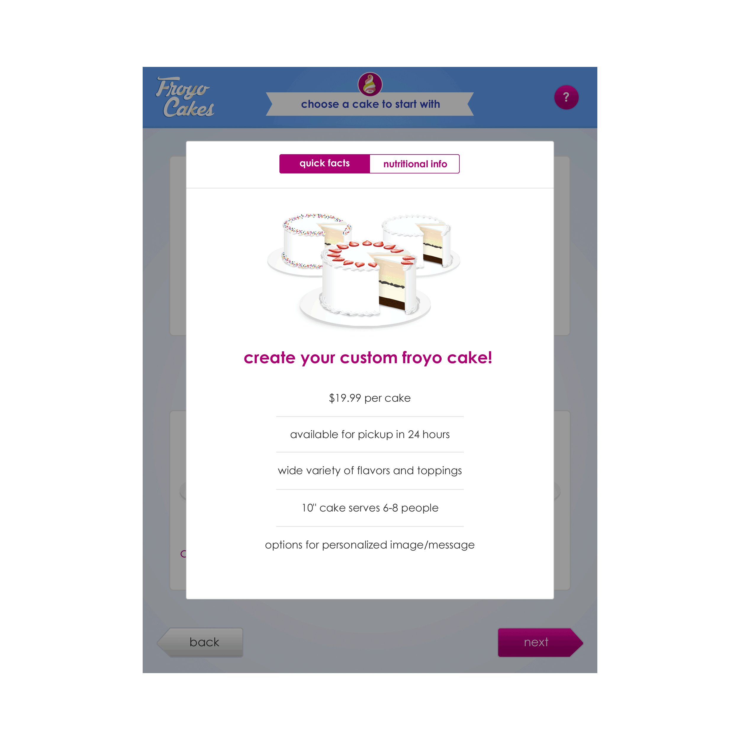
High Fidelity Prototype
The Solution

Efficient Customization
The app is easy to use with a chronological user journey.
Self Sufficient App
No need to talk to cashiers. It is easy to navigate and all thes necessary information is on the app.


